Marquee Event Redesign
Clearer progression and a streamlined game loop helped Marquee characters become top unlocks in their first week.
Problem
Players couldn't find their footing.
Players struggled to understand the original Marquee event UI. Progression was unclear, rewards were hidden, and upgrading characters forced players to leave the event.
Players were falling off after upgrading characters to three stars
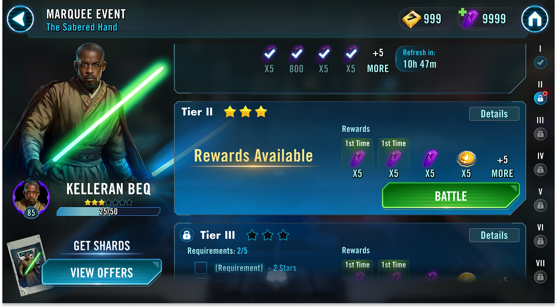
Original Marquee Event UI (pre-redesign)
Large lock icons hid requirements, rewards were scattered across multiple screens, and upgrading characters required leaving the event entirely.
Original Marquee Event UI (pre-redesign)
Design Direction
Designing a Clearer Progression Loop
The redesign focused on restoring momentum to the event experience.
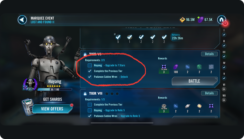
Players can now buy bundles, upgrade and promote characters, and return to battle.
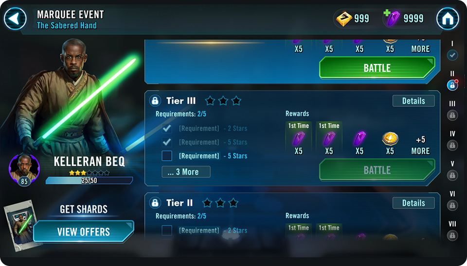
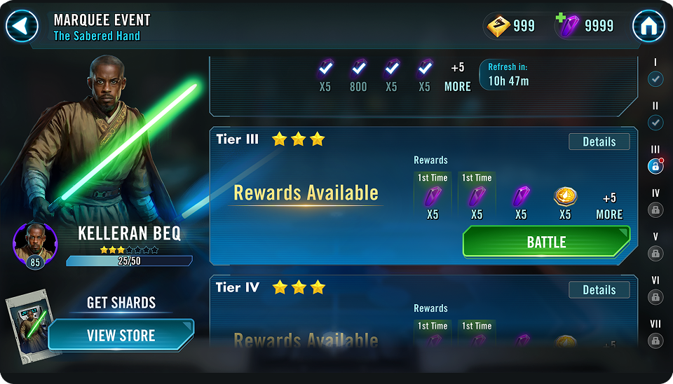
Final Marquee Event UI (redesign)
The Marquee event UI was redesigned to clarify progression, surface rewards, keep upgrades inside the event flow, reinforce player orientation, and highlight the featured character.
Final Marquee Event UI (redesign)
Prototype
Making the flow tangible before a single line of code.
I created a working prototype in Figma to demonstrate the redesigned progression loop and align the team.
Figma prototype — redesigned Marquee Event flow
Updates
Refining after launch.
Post-launch refinements improved progression states and player momentum by increasing tier contrast and auto-centering the experience on the next actionable tier.
Contrast
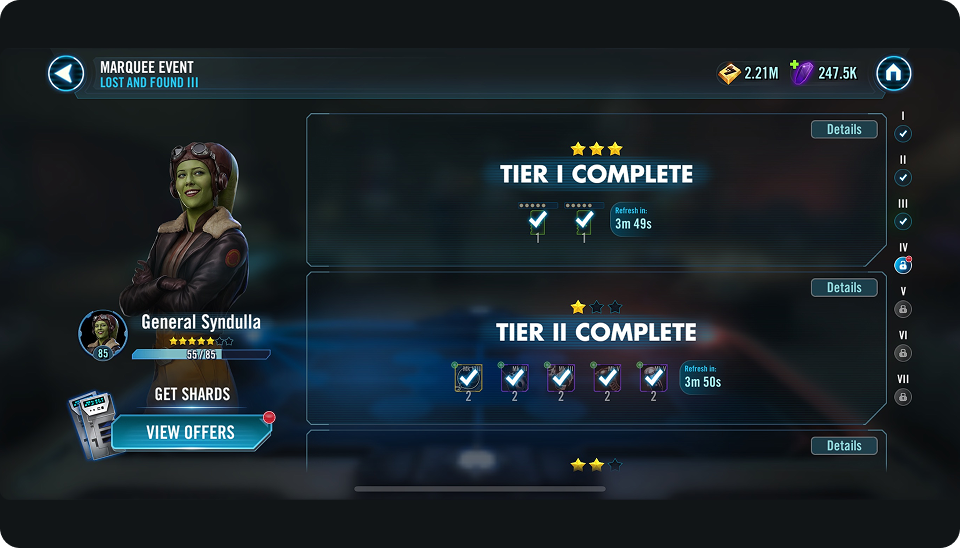
on Return
Results
Players invested faster and went further.
Characters tied to the redesigned Marquee events ranked among the top unlocks within the first week. Players invested earlier and upgraded characters faster, leading to stronger first-week engagement and higher tier completion.